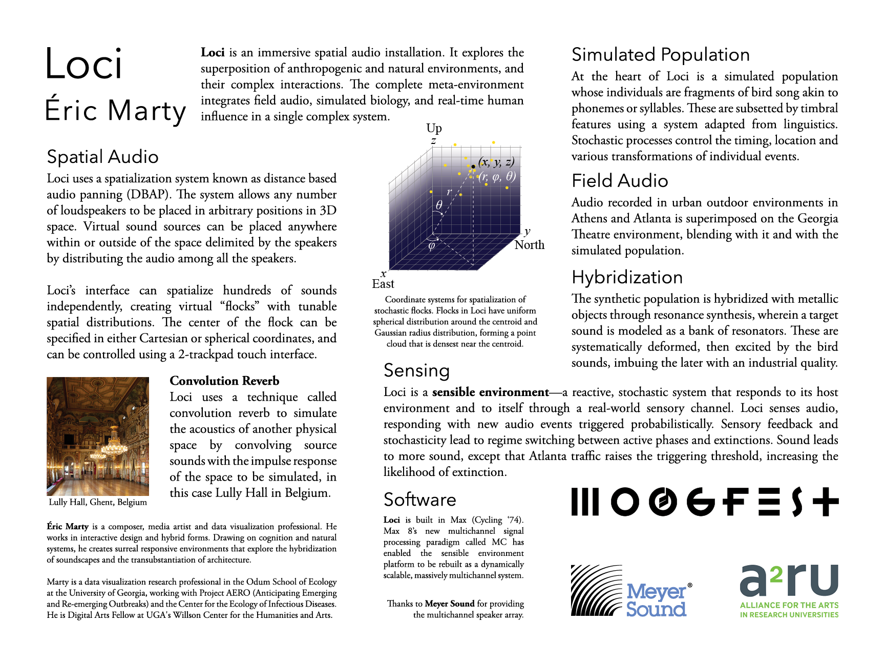
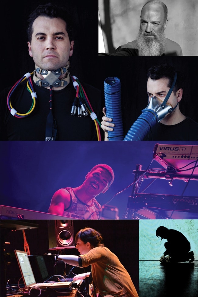
My new audio installation Loci will be up at the Georgia Theatre in Athens Georgia, Saturday, November 3, 2018. Loci is part of “Human and the Machine”, a one day event presented by Moogfest, with Kishi Bashi, Tall Tall Trees, Deantoni Parks, Lauren Sarah Hayes, and audiovisual work by REM’s Michael Stipe.
Human and the Machine is presented in conjunction with a2ru.
Meyer Sound has generouasly provided the multichannel speaker array for Loci.
The Savannah River Site (SRS) is a US Department of Energy owned facility located in South Carolina. Located within the SRS property are a series of ephemeral wetlands known as Carolina Bays, home to numerous zooplankton species. The specific species found in the bays (their community composition) changes throughout the seasons as bays fill with rain water or dry down during the hot summer months.
Data Collection: Members of the Drake lab in the Odum School of Ecology at the University of Georgia sampled 14 bays monthly between January 2009 and spring 2016. Marcus Zokan spent many hours identifying the species (and even discovering a few) in the samples collected between January 2009 and December 2010. For more about the sampling methods see Marcus’ dissertation.1
This week, our lab at the Odum School of Ecology is announcing the Zooplankton Diversity Project, a datavisualization toolkit and open dataset of 485,047 zooplankton specimens representing 133 taxa, collected from Carolina Bays of the Savannah River Site.
Data Visualizations…
Drake Lab researchers constructed a full suite of data exploration tools in D3. The tools can be used to subselect data for download or generate SVG plots of the selected data. You can use the SVG Crowbar chrome browser extension to automatically download SVG plots generated on the site.
On various pages, you will find tools for exploring species richness and species density, by taxonomic group, environmnetal covariates, species distribution by bay, species co-occurrence, population dynamics, community similarity over time, and the taxonomic tree.
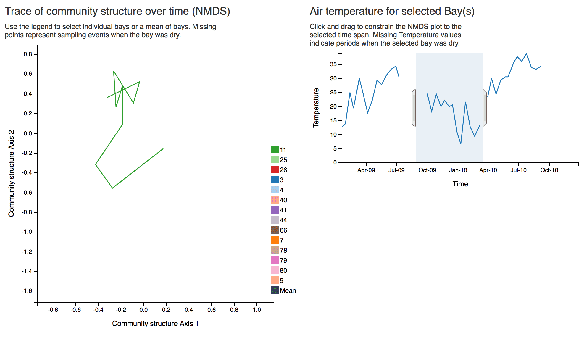
Here’s a screenshot of the Community Similarity tool. You can explore zooplankton comminity similarity over time here.
Example of an "NMDS" plot (Non-metric multidimensional scaling), representing community similarity, that expresses how much a zooplankton community changes over time. The high dimensional data representing a snapshot of a zooplankton community is reduced through NMDS to 2 dimensions, such that the distances between these 2D coordinates (over time) mirror as much as possible the distances between the coordinates in high-dimensional space. The 2D dimensions do not represent individual variables; rather they are a mapping of the high dimensional space onto 2 dimensions.
The project was spearheaded by Drew Kramer, now an Assistant Professor in the Department of Integrative Biology at the University of South Florida.
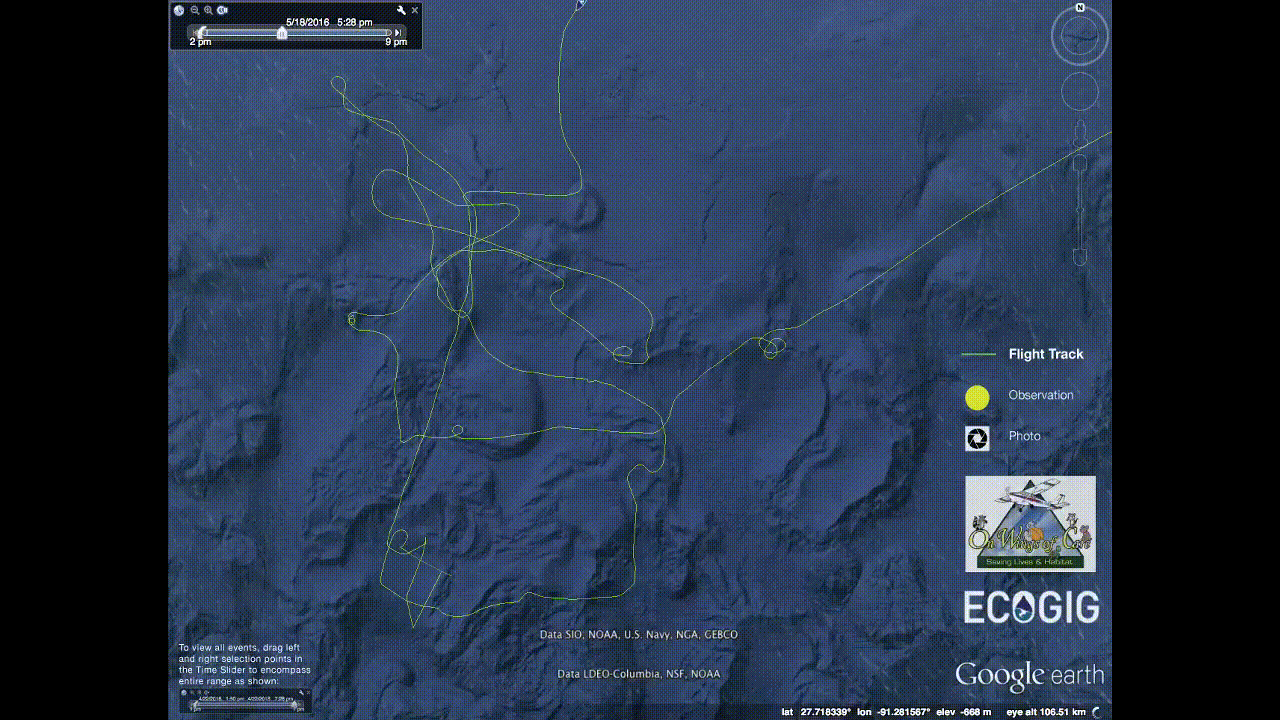
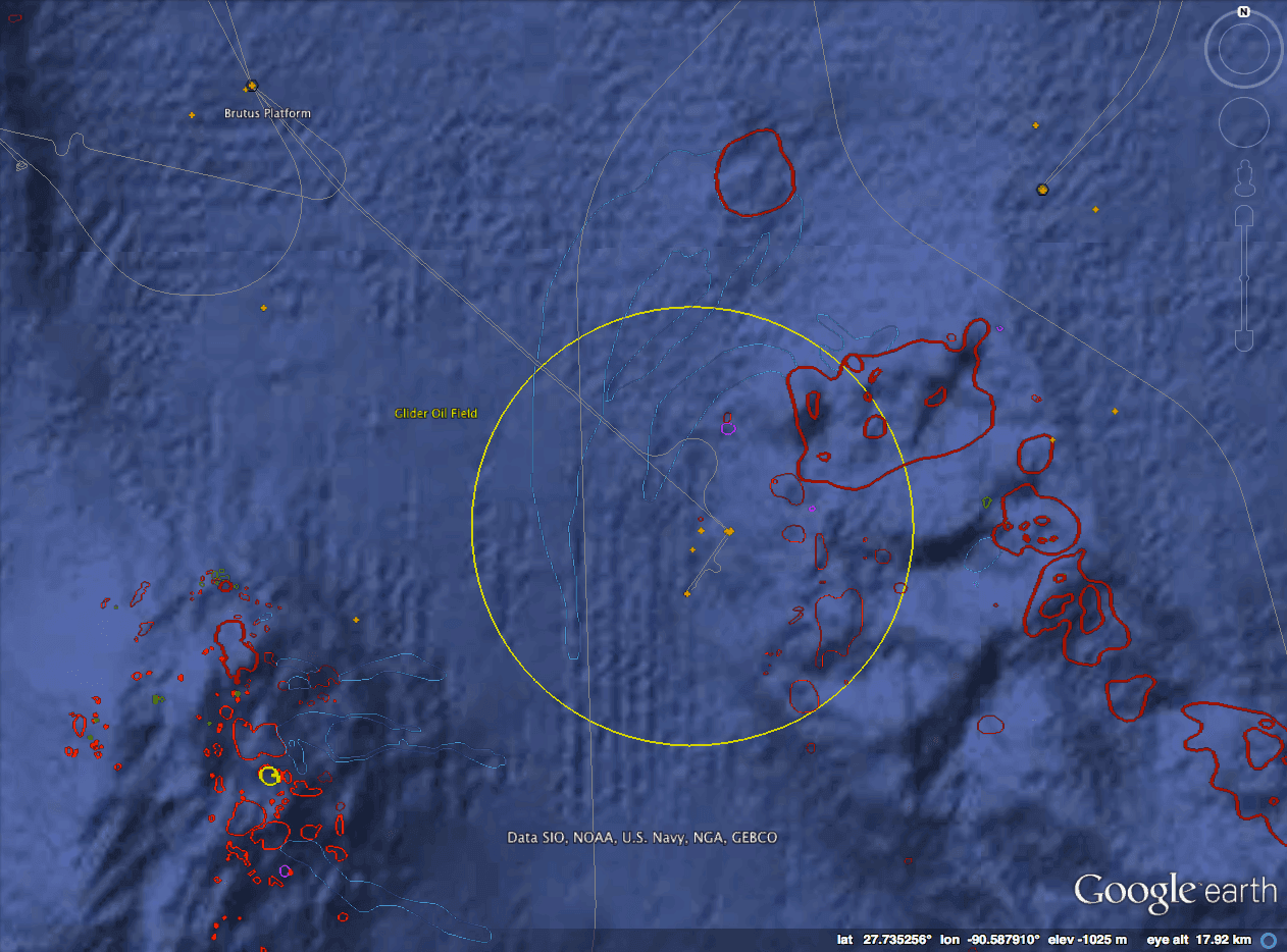
(Google Earth) Animated flight over Shell Oil Spill with photos (scroll down to download .kmz)
On May 12, 2016, an oil spill occurred in the Gulf of Mexico, originating in Royal Dutch Shell’s “Glider” Oil Field, at about 1000 m.
The leak, which according to Shell has been stopped, emanated from the infrastructure that ties the oilfield to its “Brutus” floating oil platform, about 10km (or 5 1/2 nautical miles) away.
Map of the leak area. The leak originated somehwere in the Glider field, circled in yellow, which is connected via pipelines to the Brutus platform. Areas outlined in dark red are communities of chemosynthetic organisms associated with methane hydrates and natural oil and gas seepage. Orange crosses are wellheads on the seafloor. DATA: BOEM
According to Shell, about 88,000 gallons were realeased (compare to the 206 Million gallons released in the Deepwater Horizon accident).
Visual estimates suggest the spill could be much bigger than 88,000 gallons…
ECOGIG researchers have flown over the area twice, on 5/15 and 5/18, the second flight coordinated with ECOGIG researchers on board the R/V Tommy Munro.
Update: The flight reports and images from On Wings of Care (linked to here) are not available at the moment. It looks like On Wings of Care is in the process of transfering files to a new webserver. This inlcudes the images of the spill in the kmz file below.
In her 5/15 flight report, Dr. Bonny L. Schumaker (On Wings Of Care), flying with ECOGIG scientist Ian MacDonald, wrote:
“Even if the average thickness of the visible oil were a mere 100 micron (0.1 millimeter, vastly smaller than the areas of emulsified oil that stretch across the area), the visible surface oil would represent about 500,000 gallons of oil. We haven’t seen images like this since the BP disaster of 2010.” - source
That’s much less than DWH’s 206 Million gallons, but a lot more than Shell’s estimate of 88,000 gallons for this spill. Here’s an image of the spill from the air, with a skimming operation going on tin the upper left.
You can read the full flight reports, with LOTS of photos here and here
If you’d like to see where all these photos were taken, check out the 5/18 flight path and browse images in Google Earth:
Acoustics: (1) The branch of physics concerned with sound. (2) The properties of a concert hall with respect to the way sound interacts with it.
Psychoacoustics: The branch of psychophysics that studies the sense of hearing. Psychoacoustics defines, qualifies and quantifies sensations in relation to the stimuli (sounds) that cause them.
Electroacoustics: The intersection of acoustics and electronics. Electroacoustics studies the conversion of sound into an electronic signal (called transduction), the manipulation of the electronic signal, and the conversion of the signal back into sound (also transduction).
Sound: a mechanical vibration transmitted through a medium (usually air) to the ear, with an amplitude and frequency capable of being perceived by the auditory system.
IF A TREEFALLSINTHEWOODS with no one around, it does make a sound.
IF A TREEFALLSONTHEMOON, even with someone around, it does not make a sound. (Sound does not travel in a vacuum.)
Bats produce ultra-sound (sound too high for humans to hear). Elephants produce infra-sound (sound too low for humans to hear).
Signal: any other vibration or energy variation that does not fit the definition of sound, even if the vibration or variation represents a sound. We commonly refer to electric and digital signals.
Analog Signal: A smoothly varying signal. In other words, a direct “analog” for sound. An electric signal is an analog signal. The grooves on an LP are also a type of analog signal. A cassette tape stares an analog signal magnetically.
Digital Signal: A signal that varies in discreet steps. A digital signal can be created is created by sampling an analog signal at regular interval, called the sampling rate. A digital signal is like a rasterized image: It is a series of numbers, or each number (or “sample”) representing the intensity of a signal at a given moment in time. (Whereas a raster image is a series of numbers each representing the color of an image at a given point on the screen or page.) A digital signal can be stored in a variety of ways, including magnetically (on a digital audio tape, or DAT), and optically (on a CD). A digital signal can be transmitted electrically (in a computer chip, or on a specially built electric cable) or optically (fiber optics).
Analog-to-Digital Conversion (ADC): The process of sampling an analog signal in order to create a digital signal.
SOUND → ELECTRIC (ANALOG) SIGNAL → DIGITALSIGNAL
Digital-to-Analog Conversion (DAC): The process of converting a series of samples to a continuously varying (analog) electric signal.
DIGITALSIGNAL → ELECTRIC (ANALOG) SIGNAL → SOUND
(NOTE: technically, in the diagrams above, the transition from electric to sound is “transduction.”
Sample: (1) An individual number in a digital signal. The sample represents the intensity of a signal at a given time. The sample is to a digital signal as a pixel is to a digital image. (2) The length of time it takes for one sample to go by (depends on the sampling rate, but is usually a small fraction of a millisecond). (3) An entire bit of digitally recorded sound, stored as a series of numbers (A.K.A. a stored digital signal). This is also the popular usage of the term.
Sampling Rate (in Samples per Second): (1) The rate at which an analog signal is sampled in order to create a digital signal. The most common sampling rate is 44,100 samples per second. This is the rate used by CD players. Other common sampling rates are 22,050 samples per second and 48,000 samples per second. Sampling rate is analogous to the resolution of a raster image.
How Acoustic Parameters of Sound Map to Perception (and possible data types)
physical parameter
perceptual parameter
possible data mapping (Q=Quantatiative, O=Ordinal, N=Nominal)
Frequency (Hz)
Pitch, or “height”
QON
Intensity
Loudness
(Q)ON
Waveform (spectrum)
Tone Color
(Q)(O)N
Intensity+Frequency+Waveform in Time
Timbre
(Q)(O)N
Notice, the term “volume” is not used. “Loudness” and Intensity are more precise. “Volume” is used in psychoacoustics to refer to an esoteric characteristic of sound, which could be described as its “fullness.” We will avoid the term “volume” for now.
More Definitions
Noise:
any undesirable, uncomfortable or dangerous sound. Sound pollution refers to this meaning. This is the popular meaning.
The opposite of signal. Parasitic vibrations accompanying a signal that interfere with its clear transmission. The “Signal-Noise ratio” refers to this meaning.
an a-periodic sound (a sound without a definable frequency, hence without a definite pitch). This is the opposite of “Musical Sound.”
Musical sound or pitched sound: a periodic sound (a sound with a definable frequency, hence with a definite pitch).
Unpitched sound: Noise (definition 3.)
Auditory Perception
As graphic perception must be taken into account when designing scales for visualization, auditory perception must be taken into account when designing scales for sonification of data.
One notable example of how auditory perception should influence scale design is in the construction of pitch scales.
The in-house family of higher-level tools built on top of Mike Bostock’s D3. Mike Bostock developped D3 at the Stanford Visualization Group, led by Jedff Heer. The lab moved to the University of Washington and became the Interactive Data Lab (IDL). IDL/Stanford Vis Group built the Vega declarative visusaliation language on top of D3, Vega-Lite (a simplified declarative language) on top of that, and is building a small suite of exploratory data analysis and design tools on top of Vega and Vega Lite. (IDL is also behind Tableau and the spinoff company Trifacta that makes it.)
vvvv.js — in-browser version of the VVVV visual programming environment (built on D3).
• Full GUI Web Apps
Plot.ly
Web interface for D3 (see below). Free (public charts only). Can export to SVG. Powerful. Private charts require a paid subscirption. tutorials
Dashboards.ly
Layout multiple Plotly charts on a single page and publish.
Compare to: Tableau - desktop + online drag/drop visualization editor. Publish to web. Pro version is $1000. Free student license.). Tableau Public (also free). tutorials Tableau is NOT built on top of D3, but came out of the same group that made D3, and is based on Grammar of Graphics. So, it is conceptually similar to Plotly (and Vega). Orginally called Polaris, it was commercialized as Tableau when the Stanford/IDL group created the company Trifacta.
• D3 wrappers in other languages
rCharts — extensible R wrapper. Supports many charting libraries, including NVD3, Polychart, Morris, Rickshaw, xCharts, HighCharts, and Leaflet for mapping.
Shiny - extensible web application framework for R
D3.py — python library for generating d3-based plots, using the panda module. See also: vincent, a python to Vega translator
Plotly also has API’s for the major scientific computing languages (Matlab, R, Python), so a round-about way to leverage D3 without actually using it.
 Éric Marty | @allopole
 Human and the Machine